Tuesday 10 May 2011

Evaluation Part 7 - What have you learnt about technologies from the process of constructing this product?

For my magazine I was required to use a variety of different media technologies, such as a camera for my images, desktop publishing in the form of Microsoft Publisher to create my magazine and blogger as a form of communicating my magazine task and the processes I went through to complete the task. I used the internet to gather the information I needed for many of the tasks, such as the publishing house of the magazine Q I was using as a sort of template for my magazine. I cropped images to fit into the magazine better and to make it look more effective.
Blogger

helped me communicate my process with the task with a selection of people including tutors, peers and the exmaining board.
Camera

A camera similar to this one allowed me to take the photographs I needed to complete the task of creating a visually exciting magazine.
The internet and search engines

Google allowed me to search the relevant information for my task so that I could complete it more accurately.
Publisher

This let me complete the magazines, both the preliminary task and the final product.

Monday 9 May 2011

Evaluation Part 6 - What kind of media institution might distribute your media product and why?

My magazine, compared to the readership of Q magazine, with the style I am hoping to follow, has a mass audience but in much smaller numbers. This is because I hope to attract a predominantly female audience. Q magazine is published and distributed by Bauer Media Group, a German based publishing house. The company works in the UK and 14 other countries, due to this I feel that a company with such a stand in the media industry would be ideal for magazine publishing. However I feel that due to my magazine only being published and distributed in the UK and that it is mainly aimed at a fairly small mass audience such a company would be unsuitable for my magazine. I feel this because a smaller publishing company would ensure that my magazine did reach all of my target audience. A lot of smaller magazines don't get the attention or coverage they require to be successful because their distributors fail to distribute to the areas which may allow the magazine to sell more copies to their target audience. I feel that I would go to a small independent publisher and distributor as it will hopefully boost sales in the long run as many of the areas which would not receive the magazine initially therefore extending the readership further than it would have done at first. From research I have found a variety of small independent publishing houses such as Dowse Independent Press, 328 Media Ltd, National Magazines and Anthem Publishing Ltd. These smaller companies I feel would be better and more accepting of a new venture of a music magazine and allow the magazine to flourish.

Evaluation Part 5 - Looking back at your preliminary task, what do you feel you have learnt in the progression from it to the full end product?

Since starting my preliminary task to completing my finished piece I have learnt a lot about myself and the work that had to be done.
I was responsible for all the roles played by industry professionals in both processes; such as photographer, creative director, editor and talent. For both tasks I had to arrange to take photographs, decided on a suitable colour scheme and layout along with the task of writing and editing of the copy for the magazines.
I learnt from these sometimes momentous tasks the work that must be inputted by each professional to create a high standard magazine. The organisation and communication which is vital in the process were two major drawbacks throughout the time, with lack of organisation and loss of talent due to illness and a variety of different reasons, I soon realised how much effort each member of the industry must contribute even daily.

From the creation of my preliminary task to the final edition of my magazine however I feel that I coped well. My preliminary task had a plain colour scheme and a fairly simple layout. However I did use some of the ideas from my preliminary task and also feel could have used more aspects of my preliminary layout to make my final piece better. I used the "editors note" in both and had a similar front cover style. I do feel the preliminary contents page style would have worked more effectively however as it seemed to be more attractive and easier to read.

This is my preliminary task.


Thursday 5 May 2011

Evaluation 4 - How does your media product represent particular social groups?

My social group that I aim to attract is a more indie or alternative group, they would listen to a lot of the music associated with this and therefore would enjoy reading about up and coming bands and artists along with already famous and good artists and bands.

The male figure I represent in the interview and front cover of my magazine represents the social group that can be associated with indie or alternative music. This figure could also be interpreted by the female target audience as someone to aspire to be with, a role model of sorts. however to an unintentional male audience the interview may come across to be fairly arrogant and someone that the audience could either dislike or not look up to. I hoped to represent the images in my magazine positively to my target audience and feel that using the images I did throughout my magazine I managed to create tis positive image, making my magazine more sellable and ideal for the audience I aim to sell my magazine to.


Although my magazine is aimed at an older audience I do feel personally that magazines aimed at teenagers, especially younger teens, have a responsibility to represent the right type of person as the audiences of magazines such as Top of the Pops are very influential. The teenagers that read Top of the Pops may be young enough to see a badly portrayed image as one to follow and look up to. Presenting celebritites as incredibly underweight, heavily under the influence of alcohol or drugs or publicising distateful music, such as Rhianna at present.

Evaluation 3 - How did you attract/address your audience?

How did you attract/address your audience?

The language used in my interview was simplistic yet formal, due to that it was written in an interview style it also had a conversational tone to it. I thought this was effective in connecting the audience as it allows the reader to feel as if they are almost there talking to the star also. I used a lexical field of shocking words throughout my interview for example "success", "craziness", "burst" and "ecstatic". This I think also helped engage with the audience as it gives the piece more pace and makes it overall more interesting. Also to address the audience I used a second person pronoun both in the interview and the contents page "editors note".
The images I included in my final product are mostly images of interest by the target audience, the male stars especially, yet I also included images of female stars, such as Cheryl Cole on the front cover which would be aspirational figures to the target audience or figures of interest to the target audience.

Wednesday 4 May 2011

Evaluation 2 - Who would be the audience for your media product?

Who would be the audience for your media product?

My target audience is a female group with an age range of 15 - 20, this makes it a mass market, being for many older teenagers. It is a fairly broad age range but hoping that the audience would be predominantly female makes it more specific. My target audience have a keen interest in music; artists, gigs and festivals; along with an interest in current affairs and recent events. The group would be mainly school or university students, and would spend a lot of time listening to music; live or via iPod etc, or working part time. The target audience for my magazine would also be part of the socio-economic group C2DE, although I feel that this classing system is outdated in todays society as many people from each group associate with each other and the things often related to the separate groups. My magazines target audience will also be part of the western culture as, for the release anyway, it will be published and sold solely in the United Kingdom. Due to the penumbra effect however my magazine will be consumed by people outside of my target audience, this may be because of second hand readings i.e. leaving a magazine and somebody else reading it, or it could be due to the reader looking for a different reading material to look at.

Evaluation 1 - In what ways does your media product use, develop or challenge forms and conventions of real media products?

In what ways does your media product use, develop or challenge forms and conventions of real media products?


These images are examples of contents pages, the one nearer the top of the page is my contents page and the one below it is an example of a Q magazine contents page. From a quick glance at these magazines contents pages you can see that they follow a fairly similar template, with the contents list being clearly structured and easy to read.
On the other hand at a closer look it is easily noteable that they hold very different structure and style. The contents page that was created by myself is split almost into three columns, one being images, one being the contents list and one being the "editors note". This challenges the meme of a Q magazine contents which, although split into three columns also, focuses on placeing the contents list around the main images, these images are placed in the middle column, which is ultimately larger, and are used as a focus for the audiences attention to be captured. This is effective as these images can highlight articles of interest or high profile articles, however it can draw the attention away from the contents list, thus losing attention from other articles. With this in mind, I created a contents list which was placed centrally so as to attract the audiences attention to the whole contents and not just the main articles. This is challenging the conventions of most contents pages, as many use a lot of images fro the main articles so these have a wider reader base, however I feel by placing the contents list in the centre of the page it may attract a larger readership.
Q magazine also have their logo on their contents page, this advertises the magazine further. However I didn't feel this was necessary as the magzine I created would be unique in being for a female audience, and as the contents page is so near to the cover I did not feel it was necessary to broadcast the magazine name or logo continuously throughout.
The images used, as previously noted, are more centralised, but are also layered in a scrapbook style. I placed my images in a storyboard style, although now looking more closely at other contents pages I would agree that a scrapbook, layered style seems to be more effective.
I also did not include an issue number or date, on looking at my contents page again I feel this also would have been a good convention to follow, along with the headings and subheadings that are also used in Q magazine.


The front cover of a magazine it vital: it attracts readers, builds a reputation and is easily recognisable for it's current audience. Q magazine is easily recogniseable for having the large red Q as it's logo, always placed in the same top left hand position.
My front cover followed the convention of Q magazine by including one large image on the page. I followed each convention of Q magazine but changed each slightly to suit my magazine better. The taglines is a prime example of this: I ensured I included taglines on my front cover but due to space on the page because of the size of the image and that I did not want to disturb the image with irrelevant text (text that is not part of the picture or the article the picture belongs to). This is how I changed the convention of taglines to suit my peice better, Q magazine covers a lot of the image with taglines but this seems to work well. I also included a few smaller images on the right hand side of the page, this I thought was a good idea as it may attract a wider audience as it depicts further what the magazine will contain. This however breaks away from the convention of not including smaller images and just tag lines. However I think that my idea would also be successful.


My interview was structured conventionally inline with many music magazine interviews, however how I placed the images and text could be somewhat against the conventions of music magazines such as Q as these often place images from the article around the two pages. I, however, decided to, again, put the images in a storyboard style. I feel this style is effective because the images are together and are easier to look at and attract the audience.

Thursday 31 March 2011

The pictures for my main article.

Due to that my main article will have a strip of images on the right hand side I will have to choose three to four of my photographs so that these will flow, maybe in a storyboard style, although this idea wouldn't allow for a flowing storyboard.


Wednesday 30 March 2011

The photos I will use on my front cover

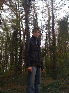
The following images I have considered for using on the front cover of my music magazine. These images I feel have certain aspects to them which would make them ideal for the front cover. This first image I feel would be suitable for a front cover image as it catches light into the image, shows the model clearly but also allows for the image to give off a certain amount of mysteriousness about the model. This can entice readers to buy the magazine as they will be curious about the model on the front cover, also considering that he will be portrayed as a 'new up and coming artist'.

This second image I feel could also be successful as a front cover image as it captures a wide span of natural woodland, this being ideal to what i would include into my article as portraying him to be at one with nature and an independent worker also, showing the image to be more detailed. This image also focuses on the style of the model, more than himself. This allows the audience to perceive him as he wants to be before seeing him, this also can create the curiosity as the first image does.

This third image would be an ideal front cover image as it focuses both upon the natural woodland and the main details of the model, this allows for both the mysteriousness and the audience curiosity to be captured. The natural scenery and that he is not looking directly at the camera also allow for the air of mysteriousness about him as he has detached himself from the shoot and that he feels more comfortable with himself.

My Pictures!


Monday 28 March 2011

Questions for my interview - DPS article

were you expectant of your success when you started out?

do you write all your own lyrics and music or do you have help?

do you prefer playing at larger or smaller venues?

how were you discovered?

what other career choices do you think you would consider?

Copy for my magazine

Main Article - Interview

Thursday 24 March 2011

Ideas Change

After thinking about the music genre for my magazine I have come to a conclusion that the idea of a rock gere music magazine is not the most suitable for me to use in my creation of my music magazine. I feel that I would rather have a wider music range within my magazine as this would make the task of finding a suitable article for my double page spread easier along with also being able to take photographs for the front cover, main article and contents. I plan now to create a magazine that will be similar in style to Q magazine. I hope that this will make the task of creating my magazine, to the best it can be, easier. I will also however ensure that I still aim the magazine at a more female audience as there is very few on the market that cater for a femle audience.

Evolution of Genres

This theory originally applies to film studies but can be adapted to other media texts.

Prototypes The original seminal texts of a genre. Conventions are not set so there may be more variety.

Classic The conventions are established. Texts are 'perfect' examples of genre. Don't have to be 'good' just conventional.

Revisionist The conventions are rewritten because society changes or the classic conventions become stale.

Parodic This phase doesn't happen in magazines.

Post-Modern One aspect of post-modernism is bricolage - the recombining of old elements and elements from other cultures to create something new. An obsession with 'retro'. Some people claim it's all been done before.

Monday 21 March 2011

Draft Pages


This idea was taken from a variety of ideas used in different music magazines, one in particular I focused upon was Q magazine, using these conventions I created my draft front cover.


Above are my draft pages for my magazine, I have used many shapes and colours to show the placement of images and copy in the magazine. I will write in a further post the reasons for choosing the placement of each of these whilst also explaining how I think this would work the most effectively.

Thursday 17 March 2011

Questionnare Results...so far

1. They do seem more aimed at males, yes.
2. I would consider buying a new one.
3. usually buy kerrang
4. lots of images of bands and artists
5. not bothered about front cover image
6. gig reviews


1. definately
2. yes
3. no
4. can't find one I like
5. good bands and artists featured on the front. covering a wide range of music.
6. eye catching colours, bold headings, clash with the colours of the house style to draw attention, new artists but also popular old artists to widen target audience
7. 'hot' attractive male band member for example or a pretty girl reading the magazine as a media portrayal of a popular magazine
8. song writing, lyrics, sheet music, which bands are doing what, interviews.

Wednesday 16 March 2011

Risk Assessment

For my photoshoot I will be required to consider each of the dangers and hazards which may occur during the shoot. One main concern is that the majority of my shoot will be in an outdoor environment. Below is the most important hazrds and the procedures that I will follow so as to prevent or minimise the risk of any happening.

Traveling to, from and around the photo shoot locations.
Walking to and from the locations could pose a potential hazard due to traffic on the roads. To overcome or prevent anything from happening here we will take extra care when crossing roads, small or busy and make sure that we are observant of any imminent dangers. We will also, as a precaution, prior to the shoot, note the locations of each crossing on the route to shoot locations so that we can plan a safer route.

Possibility of falling or tripping.
The locations of my photographs are in an outdoor environment so the possibility of tripping of falling will need to be carefully monitored. To ensure the best way to avoid accidents such as this we will, as a group, visit each location prior to the shoot, so as to note any evident obstructions or such which could threaten the possibility of a fall or injury. I will post at a later date these potential obstructions.

Lost Member of group (stranger danger)
To ensure the most prestigious care is taken when out as a group we will ensure that each member of the group is aware of one another so that any missing member will be able to be noticed as soon as possible. We will also ensure that each member has a contact number and that I will hold an emergency number for each member also.

Wednesday 9 March 2011

Deconstruction of an image


This is a member of the rock band Slipknot. They are a rock band that was formed in 1995. This image clearly shows the tropes of a heavy metal rock band. This member of the band has a very disheveled look about him, stereotypical of most rock or heavy metal bands. The image has a raw, rebellious look typical of the ideology for a heavy metal band. The look is unkempt and is typical of the style they try to portray because of the genre of music they attempt and successfully are part of.


This is an image of the JLS band member Aston Merrygold. He has a clear boy band image, with obvious tropes common in all boy bands. These being: -


  • clean shaven
  • well dressed
  • respectable image
    innocent


Monday 7 March 2011

The tasks I plan to complete by the 31st March

  • Ideal reader picture with annotations
  • Questionnaire results
  • Who are the audience: - content of the magazine - images - colours
  • Rough draft of pages I will create: - front cover - contents - double page spread
  • Deconstruction of images: - Noel Gallagher - Chester Bennington
  • Textual analysis of magazine
  • Put pictures onto my mood board
  • Risk assessment
  • Shooting schedule
  • Upload photos

Recce

For my photographs I was required to consider the location of each and the setting that would be the most ideal for my magazine. Many music magazines have their front cover image as a plain background with no specific setting, I feel that when I choose my model and take each of my photographs that I will follow this convention and have either a blank background or a simple one with little detail to it, prefereably for this shot it will be an indoor shoot. My photographs for the rest of the shoot, particuarly the ones I will use within my double page spread, I would prefer to be outdoor shoots as this will allow me to have more landscape and background to choose from. From this shoot I will also be able to take enough photographs to give me a vast range to choose the most suitable images for the articles.
My potential locations for my photographs include various places around Kettering.
My first idea is in a tree covered walkway near to the Kettering Leisure Village. I hope to take my photographs here as it will allow me to have a variety of pictures in an outdoors location which would also be fitting to the genre of the magazine. This location will allow me also to have many of contrasted shots with colour and darkness.
My second idea is a garden/field shot. It will be a lighter shot and most likely be a long shot when the pictures are taken. This will either be near to the Kettering Leisure Village area again or in a park. This shot will be better for the main image of the article as it will show the model more clearly than a darker shot.
My third idea is in a woods, near to the Brambleside estate in Kettering. This location would be ideal because it would be light enough for some light hearted shots but also then have some darker shots which could be fitting to the chosen genre also. I hope to contrast the dark of the woods with a brightness from the clothes of the model so that it allows the image to be more noticeable.


I plan to upload images of each of these locations at a later date.

Questionnaire - My questions

  1. Do you feel there is a gap in the market for a music magazines specially designed for females?
  2. Would you be willing to read and buy a new music magazine?
  3. Do you read music magazines? Yes...... (go to question five) No..... (go to question four)
  4. Why do you not read music magazines?
  5. What music magazines do you currently read? Please give reasons.
  6. What conventions do music magazines use which you feel work well?
  7. Which of these conventions do you think will work well in a new more female music magazine?
  8. What new ideas do you think could be incorporated into a new music magazine?
  9. If the front cover was to have an image of a model on, considering it's a female music magazine, which gender would be best? Male or Female?
  10. What articles most interest you when reading a music magazine?
I hope to complete results for this questionnaire by 20th March.

Friday 18 February 2011

My preliminary task - complete

This is my front cover of my prelimininary magazine, it is a school magazine for the sixth form at Southfield School for Girls

The next two images are the first double page spread of my magazine and include my contents page


My double page spread was a revision tips page for a sixth form group. It shows revision tips to help the Southfield sixth form with the run up to exams.